Four Ways to Color Your World in 2021
David Weekley Homes takes pride in staying on top of current design trends for the benefit of our Homebuyers and Homeowners, and we’re here to tell you… there’s a lot to look forward to in 2021. Among one of the first is an exciting and robust color story from the experts at Sherwin Williams. The recently released Colormix® Forecast 2021 reveals 40 trendy colors presented in four naturally inspired palettes. Carefully curated to bring a sense of rhythm and balance to life, these colors represent an opportunity to incorporate a fresh new look to the walls of your home before the clock strikes midnight to ring in a new year.
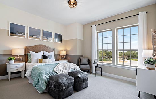
Solace and Serenity in the Sanctuary Palette
On-trend earth tones combine to forge a connection between the modern and natural worlds with the Sanctuary palette. A great way to bring a sense of the outdoors inside, shades of warm neutrals like the intense leather-inspired Antiquarian Brown and earthy red of Canyon Clay are blended with natural tones such as Pure White and Pearl Gray. These natural hues are enriched by bold hues like the deep olive gray of Oakmoss and the rich dark taupe of Urbane Bronze.
The overall message is one of wellness and calm. Drawing inspiration from the concept of nesting, colors in the Sanctuary palette make a great addition to any room of the home, whether as an accent wall, trim or base color to define an entire space. To heighten the nurturing effect this palette conveys, you can incorporate elements of biophilic design – combining natural light with a collection of houseplants and the use of natural materials and textures like stone and reclaimed wood in your furniture and décor.
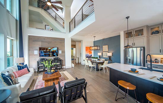
Create Gathering Spaces with the Encounter Palette
The Encounter palette is bold and beautiful all at once. Thoughtfully curated to create an authentic sense of space, Encounter draws inspiration from nature with earthy shades of brown, green, gold and blue juxtaposed against softer hues of ivory, tan and gray. The overarching message for this collection is rooted in culture and artisan craft – making it a great fit for Modern Boho interior design.
The striking Reddened Earth and vibrant Tarnished Trumpet have the makings of an eye-catching accent wall, while Alabaster serves as a clean and refreshing backdrop for any room. The herbal green of Rosemary makes a bold statement in a room filled with natural elements like sisal rugs, rattan accents, wood furniture and baskets as décor. Add in the soothing gray of Jubilee as an ideal trim or accent color.
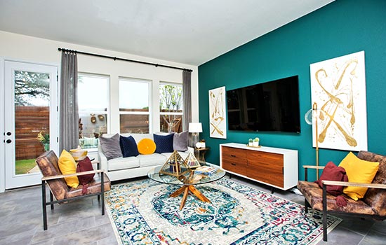
Explore Choices with the Continuum Palette
The color professionals at Sherwin Williams looked high in the sky and deep in the sea to find inspiration for the Continuum Palette. Infinitely more playful than the Sanctuary and Encounter palettes, the colors of Continuum convey a blended sense of optimism and imagination – making it a great fit for Mid-century modern design. The bright pastel shades of Swimming turquoise, Novel Lilac and Limon Fresco gold serve as cheerful pops of color against High Reflective White, the deep charcoal gray of Cyberspace and the regal navy blue of Commodore.
With space and sea as its muse, this palette is a celebration of the spirit of positivity as it faces the future without fear. If drawn to this particular palette, it suggests that you should be equally fearless with your design choices. Enter 2021 with abandon – if you want to paint your ceiling turquoise, an entire room a rich blue or an accent wall an alluring shade of lavender, by all means, do it. With space and sea as its muse, this palette is a celebration of the spirit of positivity as it faces the future without fear. If drawn to this particular palette, it suggests that you should be equally fearless with your design choices. Enter 2021 with abandon – if you want to paint your ceiling turquoise, an entire room a rich blue or an accent wall an alluring shade of lavender, by all means, do it.
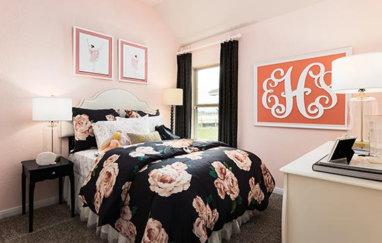
Weave a Color Story with the Tapestry Palette
Ending on an exuberant note, the Tapestry palette marks a beautiful blend of happy colors in vibrant shades of pink, coral, yellow, blue and green balanced against slightly more classic shades of black, gray and ivory. Conveying a sense of security intended to inspire creative expression, this palette suggests tossing caution and the concept of minimalism to the wind in favor of maximalism. Have fun with Tapestry – it proves a great fit for interior design founded in classicism with daring touches. Sweeten up an entire living space with vivacious Jaipur Pink – from the walls to the trim.
Or be even more daring by painting your walls Tricorn Black, brought to life with white trim and chair rail as backdrop to exciting pops of color in your furniture, artwork and décor. A Perfect Periwinkle accent wall is an eye-catching addition to the family room, while an Alexandrite green accent wall in the entry way will let your guest know they’re in for a real design treat. All-in-all, Tapestry has the feel of Old Hollywood – as though rooms painted in these shades are oozing with luxury and star power – ripped from a vintage issue of Vogue.
Take a look at all the colors in the Colormix® Forecast 2021 to get a jump start on the latest trends now!